Test Case Repository
The Test Case Repository is where you organize and manage your project's test cases.
Structure
- Folders: Organize test cases hierarchically using folders.
- Test Cases: Individual test specifications containing steps, expected results, and other relevant information.
Viewing the Repository
Navigate to Projects -> [Your Project] -> Repository from the sidebar.
You will see:
- Folder Tree View: A hierarchical view of folders on the left.
- Test Case List: A list of test cases within the selected folder on the right.
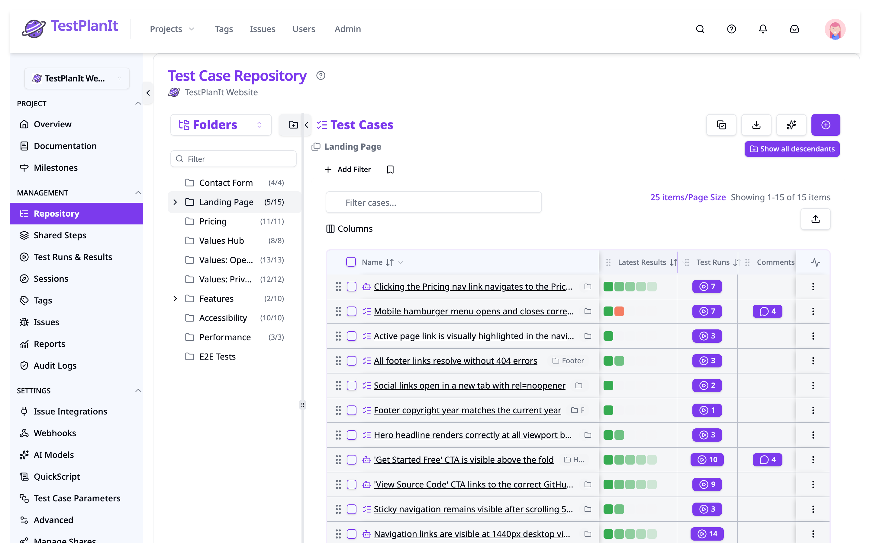
Adding Folders and Cases
- Add Folder: Click the "Add Folder" button (usually near the top of the folder tree).
- Add Case: Click the "Add Case" button for manual test case creation (see Add Test Case).
- Generate Test Cases: Click the "Generate Test Cases" button (sparkles icon) to use AI-powered generation from issues or requirements (requires LLM Integration).
- Import Cases: Click the "Import Cases" button to bulk import test cases from CSV files.
Editing and Organizing
- Renaming/Deleting Folders: Typically done via context menus (right-click) or buttons within the folder tree.
- Moving Folders/Cases (Drag & Drop): Folders and test cases can often be reorganized by dragging and dropping them within the tree or list.
- Editing Cases: Click a test case name to open its Case Details in a docked panel beside the list, or use the row's Edit action to open the full details page in edit mode.
- Deleting Cases: Often done via buttons or context menus in the test case list or on the details page.
- Adding/Editing/Moving/Deleting Folders & Cases: Requires the
Add/Editpermission for theTestCaseRepositoryapplication area. Users without this permission will not see "Add Folder" or "Add Case" buttons, cannot rename/delete folders, and drag-and-drop functionality will be disabled. - Deleting Cases: Deleting individual cases also requires the
Deletepermission for theTestCaseRepositoryapplication area. The specific delete actions might be hidden if the user lacksAdd/Edit(preventing access to edit menus) orDeletepermission. - Viewing Empty Repository: If a user without
Add/Editpermission views an empty repository, they will see a message indicating they don't have permission to add items, rather than the standard prompt to create folders/cases.
Layout
The page features a resizable two-panel layout:
-
Left Panel (Navigation/View Selection):
- View by Selector: A dropdown at the top of the panel that chooses how the case list is grouped — Folders, Template, State, Creator, Automation, Parameterization, Attachments, Code Pins (when Impact Analysis is enabled), Tag, Issue, and one entry per custom field. See Views & Filtering.
- Folder Tree (Folders View): Displays a hierarchical structure of folders. You can:
- Expand/Collapse folders using the chevron icons. Hold ⌥ (Alt on Windows and Linux) while clicking a chevron to expand or collapse all of that folder's subfolders at once; on a top-level folder the same click applies to every folder in the tree.
- Filter the tree by name. Projects with more than 15 folders show a filter box above the tree; matching folders stay in place under their parents so you can still see where each one sits, and clearing the filter restores whatever you had expanded.
- Select a folder to view its contained test cases in the right panel.
- Drag and drop folders to reorder them or change their parent (except in Run Mode, or while the tree is filtered).
- Add a new folder using the Add Folder button (icon: CirclePlus) at the top.
- Edit an existing folder's name/docs using the Edit button (icon: SquarePen) that appears on hover.
- Option Rows (Other Axes): When the axis is anything other than Folders, the panel lists that axis's values (templates, states, creators, tags, field options, and so on), each with a count of matching cases. Clicking a row adds a filter for that value and the row stays highlighted while it is active. See Views & Filtering.
- Collapse Button: A chevron button (
</>) on the handle between panels allows collapsing or expanding this left panel.
-
Right Panel (Test Case List):
- Breadcrumbs (Folder View Only): Shows the path to the currently selected folder. Next to the breadcrumb, a Show all descendants toggle (folder-down icon) lets you view test cases from the selected folder and all of its nested subfolders in a single list. When enabled, each test case row displays a folder badge showing which subfolder it belongs to, with a tooltip showing the full folder path. All existing sorting, filtering, and bulk actions work on the aggregated list.
- Add Case Button: Allows adding a new test case using a detailed modal (
AddCaseModal). - Generate Test Cases Button: Opens the AI generation wizard (sparkles icon, requires LLM Integration).
- Import Cases Button: Opens the CSV import wizard for bulk test case creation.
- Filter Bar: The active filters, shown as chips directly above the table, alongside the Add Filter button and Clear All. See Views & Filtering.
- Filter Cases Box: A Filter cases... box that narrows the list to the cases whose name contains what you type. It applies on top of the folder scope, the grouping axis and every filter chip. See Searching.
- Column Selection: Choose which columns are visible in the table using the Columns control. Your selection is remembered automatically — it is saved in your browser and scoped to this project's repository, so the columns you pick are still there the next time you open it.
- Pagination: Controls for navigating through pages of test cases.
- Test Case Table (
DataTable): Displays the list of test cases based on the current selection/filters. Supports:- Sorting via the column header menu: Each column header opens a menu with Sort ascending, Sort descending, Manual sort (clears the sort), and Hide column. The active sort column shows a faint tint plus a directional accent bar — along the top edge when sorted ascending, the bottom edge when descending. The sort column and direction are remembered per project.
- Reordering and resizing columns: Drag a header by its grip to reorder columns, or drag a header's right edge to resize it. The pinned checkbox, Name, and Actions columns stay in place. Column order and width are remembered per project alongside your visibility choices.
- Reordering cases via drag-and-drop within the table (only when sorted by the default
ordercolumn and not in selection mode). - Clicking a test case name opens its details in a docked Test Case Details panel beside the list (see Test Case Details Panel below).
- Quick Add Row (
AddCaseRow): An inline form at the bottom of the table for quickly adding a new test case with just a name and state (uses the project's default template).
Views & Filtering
Two controls work together. The View by list in the left panel decides how the case list is grouped and gives you a one-click way to filter on that axis. The filter bar above the table holds every filter that is actually applied, as removable chips. They are independent: switching the grouping axis regroups the list but never adds, seeds, or clears a filter.
View by
Pick an axis from the dropdown at the top of the left panel. The axes are listed alphabetically, with Folders pinned first as the default. Every axis other than Folders lists that axis's values in the panel, each with a live count.
Clicking an option row toggles a filter for that value: a chip appears on the filter bar and the row stays highlighted for as long as the filter is active. Click the row again — or remove the chip — to drop it. The All … row at the top of each axis (All Templates, All States, All Cases, All Values for a custom field, and so on) clears the filters those row clicks created for that axis, and is highlighted whenever the axis is unfiltered. Axes with more than ten values render a searchable, paged picker instead of a flat row list.
The available axes are:
- Folders: The hierarchical folder tree, and the default axis.
- Template: The template each case uses.
- State: The current workflow state.
- Creator: The user who created the case.
- Automation: Automated / Not Automated.
- Parameterization: Parameterized / Not Parameterized. See Parameterized Test Cases for what makes a case parameterized.
- Attachments: Has Attachments / No Attachments. Only files currently attached count — a case whose attachments were all removed appears under No Attachments.
- Code Pins: Has Code Pins / No Code Pins. Only appears when the project has Impact Analysis enabled. A Code Pins column in the table shows how many live pins each case carries and can be sorted; pins that were removed do not count.
- Tag: Any Tag and No Tags stay pinned above the list of individual tags.
- Issue: Any Issue and No Issues above the list of linked issues. This axis only appears when at least one case in the project has an issue linked.
- One axis per custom field: Dropdown, Multi-Select, Link, Steps, Checkbox, Integer, Number, Date, Text Long, and Text String fields each get an axis, named after the field. Dropdown and Multi-Select list their options (plus None when the field is optional), Checkbox shows Checked / Unchecked, and the remaining types show a has-value / no-value pair such as Has Date / No Date.
Opening the repository as part of a test run (Run Mode) adds two more axes alongside the rest:
- Assigned To: Unassigned, plus each member the run's cases are assigned to.
- Status: Untested, plus each configured result status such as Passed, Failed, or Blocked.
Filtering
Add Filter on the bar opens a searchable, alphabetical list of everything you can filter on: templates, states, creators, automation, parameterization, attachments, code pins (when Impact Analysis is enabled), tags, issues, every filterable custom field, and — in Run Mode — status and assignee. Pick one and its chip opens ready to edit.
Each chip reads Field: operator values. Click the chip body to reopen its editor and change the operator or tick more values, or click the x to remove it. Clear All appears once two or more filters are active. When a filter set leaves no matching cases, the table says so and offers the same Clear All.
Filters combine like this:
- Filters on different fields are combined with AND. A Template chip and a State chip return the cases matching both.
- Several values inside one chip are combined with OR. A Template chip holding two templates returns the cases using either.
- Tag and Issue chips add an operator choice: Any of (carries at least one of the listed values), All of (carries every one of them), and None of (carries none of them).
- A chip with no values reads Has value or Is empty. A Tag chip set to Is empty returns the cases with no tags at all.
There is no way to OR across different fields — every chip narrows the result set further.
An emptiness filter and a specific value on the same field would match nothing together, so they are mutually exclusive: selecting No Tags while a specific tag is filtered drops the tag filter, and picking a tag drops No Tags. A valued None of is not an emptiness claim, so "has tag A but not tag B" is still expressible as a Tag: Any of A chip plus a Tag: None of B chip.
Filters apply to whatever the list is currently showing: in the Folders view that is the selected folder, plus its subfolders when Show all descendants is on; on every other axis it is the whole project.
Custom-field chips offer the operators that suit the field's type:
| Field type | Operators |
|---|---|
| Dropdown, Multi-Select | Is any of, Any of, None of |
| Checkbox | Is (Checked / Unchecked) |
| Integer, Number | =, ≠, <, ≤, >, ≥, Between, Has value, Is empty |
| Steps | =, <, ≤, >, ≥, Between, Has value, Is empty |
| Date | On, Before, After, Between, Last 7 days, Last 30 days, Last 90 days, This year, Has value, Is empty |
| Text Long, Text String | Contains, Does not contain, Starts with, Ends with, Equals, Has value, Is empty |
| Link | Contains, Domain contains, Starts with, Ends with, Equals, Has value, Is empty |
What the counts mean
The number beside an option — in the left panel and in a chip's value list alike — is what you would get by clicking it. Each field's counts are calculated under all of the other active filters — and, in the case-selection dialog, under the current search — but not under its own, so filtering on a field still shows you what its other values would return. Counts cover the whole project (in Run Mode, the whole run) and are not narrowed by the selected folder. While fresh counts are being fetched the previous numbers stay on screen, dimmed, with an "Updating counts..." tooltip.
Sharing and limits
Filters are held in the page URL, so a link reproduces exactly the filtered list you are looking at, and a reload keeps it. A filter set too large for a readable URL is stored compressed in a single parameter instead. Filters and search text set inside the case-selection dialog are kept in memory only and never touch the URL of the page behind it.
A filter set can hold up to 50 filters, each with up to 200 values. Add Filter is disabled once you reach 50 filters and says why, and a value list stops accepting new values at 200 with the same kind of notice. A link that arrives carrying more than either limit is trimmed down to fit, and a notice beside the chips tells you that filters or values were dropped.
Saved views
A link covers ad-hoc sharing. When a set of filters is one you keep coming back to, give it a name instead: the bookmark icon on the filter bar holds your saved views for the project.
Saving a view
- Build the view — add the filter chips you want and pick a grouping axis.
- Open the bookmark menu and choose Save view. (This stays disabled until there is something to save — a filter, or a grouping other than the default.)
- Give it a name and, optionally, a description.
- Click Save.
Loading a view
Open the bookmark menu and click any saved view to apply it. Its filters replace whatever is on the bar and its grouping axis is restored, and a message confirms which view was applied.
Managing saved views
Each view in the menu has two actions:
- Rename (pencil icon) — Update the name and description.
- Delete (trash icon) — Remove the view after a confirmation prompt.
Good to know
- Saved views are private to you. Only you can see and apply the views you save.
- A view belongs to one project. The menu lists the views you saved in the project you are looking at.
- A view stores criteria, not a snapshot of cases. Applying one runs fresh against the current repository.
- A view stores filters and grouping — not search text. Search stacks on top of a view rather than being part of it.
- An applied view is still shareable. Applying a view updates the page URL, so you can copy the link and hand the same list to someone else.
- A view survives the fields it referenced. If a custom field a view filtered on has since been deleted, the view applies everything that is still valid and tells you how many filters it skipped. If its grouping axis is gone, the default grouping is used instead.
- Views work in the case-selection dialog too. You can save and apply views when picking cases to add to a run or plan. A view saved inside a run that filters on Status or Assigned To applies only its remaining filters outside a run, where those fields do not exist.
Searching
The repository's own search is the Filter cases... box above the table. It narrows the list you are looking at to the cases whose name contains what you type, and it stacks with everything else: the folder scope, the grouping axis and every filter chip still apply.
For full-text search across a project — step text, custom field values, and the rest of a case's content — use Advanced Search, reachable from anywhere in the app with the search icon in the top navigation bar or Cmd+K / Ctrl+K. It covers the repository, so the repository page itself carries no full-text search box.
The case-selection dialog used when adding cases to a run or plan does have its own full-text search box, because Advanced Search cannot be opened from inside the dialog. That search intersects with everything else rather than replacing it: the folder scope, the grouping axis, and every filter chip all still apply. Searching does not clear your filters, and filtering does not clear your search.
- While a search is active and you have not chosen a sort, results are ordered by relevance and the list says Sorted by relevance.
- A search that matches more cases than the search index will return in one result set shows Filtering within the top 10,000 matches beside the chips: filters and counts apply to those matches only.
- If the search cannot be run, the list reports the failure instead of falling back to unfiltered results.
A test run's own case list has no full-text search box; use the filter bar there instead.
Run Mode
The first time you open a run's case list, an Assigned to me filter is applied for you if that run has cases assigned to you. It is an ordinary chip — remove it to see the whole run. The seeding is skipped when the link you arrived on already carries filters or points at a particular case, so a shared link always shows what its sender saw. A quick Assigned to me toggle also sits on the filter bar in Run Mode for turning that filter on and off later.
Test Case Table Columns
The main table displays the following information for each test case:
- Checkbox: For selecting multiple cases for bulk actions (like adding to a test run or deleting).
- Name: The title of the test case. Each row shows a type icon — robot for automated cases, checklist for manual cases — followed by a stacked-squares badge when the case is parameterized. Clicking the name opens the Test Case Details panel beside the list.
- Template: The template used by the test case.
- State: The current workflow state of the test case.
- Priority: The assigned priority level.
- Estimate: The manually set estimated time (often shown in a human-readable format like "5m") required to execute the test case.
- Forecast: An automatically calculated prediction of execution time based on historical results. See Test Case Details for more info.
- Tags: Associated tags.
- Latest Results: The case's last five results across all test runs, newest first, drawn as small colored squares (the most recent at full strength, older ones progressively faded). Each square links to the run that produced it, and the history covers both manual run results and automated JUnit results. Hovering over a square shows the status and when it was executed. The column is sortable: clicking the header groups cases by the status of their most recent result, and cases that have never been executed always sort last, in either direction.
- Last Updated: Timestamp of the last modification.
- Actions (Ellipsis Menu):
- Edit: Opens the Test Case Details page in edit mode.
- Delete: Initiates the soft delete process for the test case, requiring confirmation.
Additional dynamic columns appear based on the fields defined in the templates used by the displayed cases.
Remembered column choices
Your column layout — which columns are visible, the order they appear in, and each column's width — is saved per project and restored each time you return. The sort column and direction you last applied are remembered the same way. Because the available columns change with the templates in view, choices are matched by column: a column you hid or showed is restored whenever that column is present, and any saved choice for a column that is not in the current view — for example a removed template field, or a field that belongs to a template you are not currently looking at — is simply ignored. Switching between templates therefore keeps each template's columns the way you left them. If you open the repository from a shared link whose URL specifies columns, those columns take precedence for that visit.
Test Case Details Panel
Clicking a test case name opens its Test Case Details in a docked panel to the right of the case list, without leaving the repository. The selected case's row stays highlighted in the list — the highlight fills across the pinned columns — and stepping between cases moves the highlight without scrolling the list.
- Resizable split: Drag the divider between the list and the panel to set how much space each takes. Your split is remembered.
- Full-width toggle: The expand control in the panel header hides the folder tree and case list so the details fill the whole content area; collapse it to return to the split view. On narrow viewports the panel automatically takes over the full width.
- Prev/next navigation: The header shows the selected case's position as "N of total" and steps through the entire filtered result set — across page boundaries, not just the visible page. With Show all descendants enabled, it spans every case in the selected folder and its subfolders. When focus is not in a field or editor, the left/right arrow keys step to the previous/next case.
- Open full page and close: The header also links to the standalone full-page view (opens in a new tab) and provides a close control. The browser Back button closes the panel as well.
Drag and Drop
While you drag a test case, the valid drop destinations are outlined with a dashed border and labeled so the outcome is clear before you release:
- The reorder zone within the case list shows Drop to reorder.
- The folder tree shows Drop on a folder — hold ⇧ to move, ⌥ to copy (on Windows and Linux, Drop on a folder — hold Shift to move, Ctrl to copy). Once you hold a modifier, the label switches to Drop on a folder to move or Drop on a folder to copy to confirm the chosen action.
Reordering Test Cases
When the table is sorted by the default Order column and selection mode is off, you can drag any test case row to a new position within the same folder. A blue indicator line shows where the case will land. Releasing the row commits the new order.
Moving Test Cases to a Folder
Drag one or more test cases from the table and drop them onto a folder in the folder tree. When you release, a small popover appears with three options:
- Cancel — discards the drop and leaves all cases in place.
- Move — transfers the cases to the target folder. Version history and comments are preserved.
- Copy — creates duplicates of the cases in the target folder. Copies start at version 1 with no prior history.
Bypassing the Popover with Modifier Keys
Hold a modifier key while dragging to skip the popover entirely — the operation fires immediately on drop:
| Platform | Copy | Move |
|---|---|---|
| Mac | Hold ⌥ Option | Hold ⇧ Shift |
| Windows / Linux | Hold Ctrl | Hold Shift |
The drag preview badge updates in real time to reflect the active modifier — a copy icon when copying, a move icon when moving, and an up/down arrow icon when hovering over a reorder zone (where copy and move have no effect).